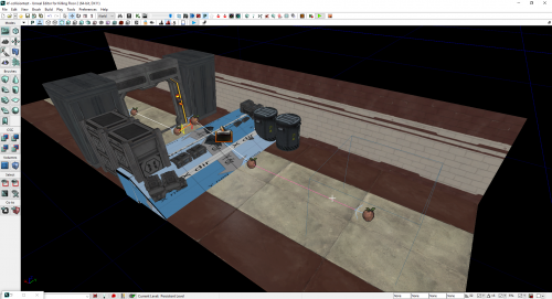
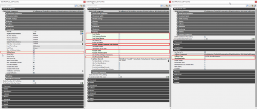
Map Optimization Guide (Killing Floor 2): Difference between revisions

From Killing Floor 2 Wiki
Jump to navigation Jump to search
No edit summary
mNo edit summary
 
(One intermediate revision by one other user not shown)
Line 1: Line 1:
[[Category:KF2]]
==Introduction==
==Introduction==
This page will give a comprehensive guide to increasing the performance of your map while also optimizing the player experience; looking at making smooth player movement around the map and general bug fixing. It is recommended that you read through the entire guide and apply all the principles to your map before you release it on the workshop.  
Line 68: Line 69:
{{Note|1= An extremely comprehensive video tutorial made by Seanchaoz perfectly explains how to optimize movement for your maps: [https://www.youtube.com/watch?v=vb-enruIrR4 KF2 SDK Guide - Basic Movement Optimization]}}


You can download a sample map of the issues and solutions discussed below here: [https://drive.google.com/drive/folders/1j-9fxc_U3x2lZIBMM9pxuGKsMXq7UgwC KF-MovementOptimizationExample]
You can download a sample map of the issues and solutions discussed below here: [https://drive.google.com/open?id=1sjinr2bT9uuKSCnOomXhc9GGwdZbaNSy KF-MovementOptimizationExample]


'''Figure 3.1''' shows a typical corridor, on the surface it looks fine but there are a couple of problems that will frustrate players that should not exist:

Latest revision as of 22:45, 10 September 2019

Introduction

This page will give a comprehensive guide to increasing the performance of your map while also optimizing the player experience; looking at making smooth player movement around the map and general bug fixing. It is recommended that you read through the entire guide and apply all the principles to your map before you release it on the workshop.

The techniques below are listed in order of the stages you should implement them; starting from being able to apply them at anytime and ending with final/last stage tweaks before publishing a map.

Lighting and Dynamic Shadows

PointLights VS SpotLights

SpotLights perform better than PointLights. SpotLights cast in 1 particular direction, While Pointlights have to cast multiple SpotLights in directions around the entire radius (PointLights are 2x more costly in performance; however in saying this - you are able to have many combinations of PointLights and SpotLights without too much of a performance hit).

Both lights are affected by the size of the Radius that they have - as you would expect, having a larger radius has a larger impact on performance. It is recommended to adjust the radius size to be just enough to get the desired effect and not to be over generous. You may be able to achieve the same lighting intent with a smaller radius and larger brightness.

The PointLight Pitfall

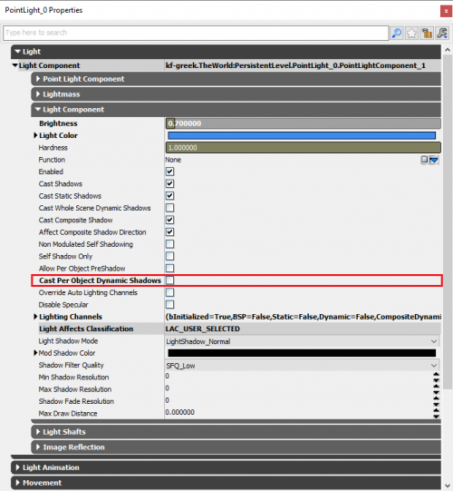
One trap a lot of new maps fall into is the unintended over-use and mishandling of dynamic shadows with PointLights. This is not entirely the level designers fault as one particular variable: Cast Per Object Dynamic Shadows is enabled by default. This is located under the PointLight Properties > Light Component > Light Component. See Figure 1.1. You always want to make sure that this variable is DISABLED for any PointLights in your map. Dynamic Shadows should only be reserved for SpotLights.

!--T:1--> Warning Warning: NEVER USE DYNAMIC SHADOWS WITH POINTLIGHTS!

This particular option may not seem problematic when playing in the editor, this is because the performance hit only occurs when there are many actors (Zeds/Players) within the light's radius. Each of these actors will be casting dynamics shadows, which are already quite demanding. During gameplay, you may see huge fluctuations with your FPS based on the action/number of zeds present in the screen within the vicinity of these lights. This performance hit can be magnified quite significantly when you end up having a cluster of PointLights also casting multiple dynamic shadows in the same area.

You can easily check and disable this variable on all PointLights on your map by:

  1. Right Clicking any PointLight
  2. Selecting Select > Select All PointLight Actors
  3. Pressing F4 to open the properties and Disabling Cast Per Object Dynamic Shadows located under Light > Light Component > Light Component for all selected lights.

Doing this trick alone should see a significant increase in performance if they were previously enabled.

SpotLights casting Dynamic Shadows

Dynamic Shadows are quite an intensive features to use in a map. Their performance impact is proportional to the complexity of the geometry of the mesh and actors (Players and Zeds) that they cast shadows from. Poor performance can be magnified if there are a cluster of SpotLights that cast Dynamic Shadows as well.

Try to use them sparingly and avoid clustering them together. Try to use them to accent certain parts of the map, as opposed to making all SpotLights cast them, this allows them to have a larger visual impact; less is more (eg: Casting shadows from car high-beams/floodlights, using them on alarm systems or around a fireplace - usually locations/lights that are quite bold).

Figure 1.1: Disabling Dynamic Shadows on Lighting

Mesh Density and Material & Particle Effect Complexity

Although there really aren't any guidelines for using meshes and materials, mappers should still take notice of things such as the amount of tris in meshes and the complexity of materials applied. It can be very easy to take good looking complex meshes for granted and place them generously around the map, resulting in clusters of high tri densities that may impact performance when looking at them. Anything with a tri count in the 3,000 or more range should be used with regards to their complexity; reducing frequency as the tri count increases.

The same thing can be said for materials, you should be aware that the following types of materials may impact performance when you have high densities of them:

  • Transparent Materials like glass, water, smoke and foliage/leaves
  • Materials that move and displace the mesh like leaves (in the wind) and water
  • Animated and moving textures within the material like fire or smoke

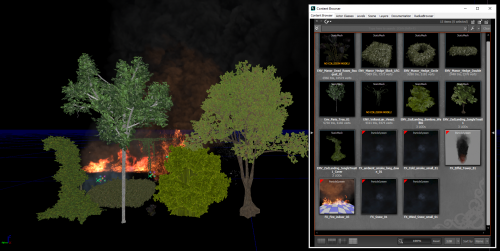
Tree and foliage assets fall into both of these categories (especially Zed Landing assets). Tree meshes usually contain a large number of tris to display leaves. These leaves also use transparent and displacement materials. When coupled together, small clusters of trees and foliage can immediately hit performance. This can be very easy to do since they look decent placed anywhere, so we can get carried away placing many different combinations of trees and foliage. This isn't so much saying "Never use them", more or less just use them wisely; if you can turn the coverage of some foliage from 5 meshes to 2-3 (or even 4) without any major visual impact, definitely do it.

The same principles apply to particle effects, especially those that create fog, smoke or use transparent textures/materials. An overuse and mishandling of them can quickly lead to poor scene performance.

Figure 2.1 Shows some examples of assets that when overused may see a performance hit in your scene, these mainly contain high tri counts or/and use complex materials.

Figure 2.1: Deceptively Complex Assets

Movement Optimization

What and Why?

!--T:1--> Important Important: BEFORE YOU CONTINUE: Load your map and run along ALL the walls hugging it as tightly as possible. If you clipped or stopped moving at any point, your map needs movement optimization and is not ready for the workshop.

All players can relate to the frustration of kiting around a map only to get stuck on a random part of it which leads to their death.

Movement optimization is based on a general understanding that although in the real-world we can contort our bodies around objects as we move, the game-world does not provide that luxury due to engine limitations with collisions. Because of this, we have to dedicate some additional time to work around the limitations of in-game collisions to make sure that players do not clip or get stuck on parts of the level.

How?

!--T:1--> Note Note: An extremely comprehensive video tutorial made by Seanchaoz perfectly explains how to optimize movement for your maps: KF2 SDK Guide - Basic Movement Optimization

You can download a sample map of the issues and solutions discussed below here: KF-MovementOptimizationExample

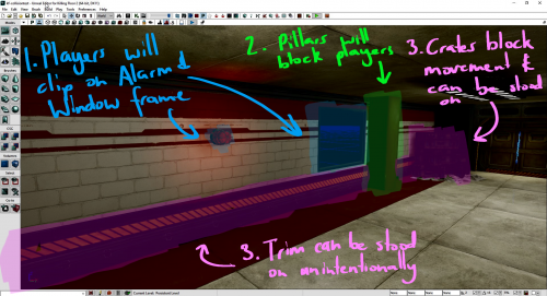
Figure 3.1 shows a typical corridor, on the surface it looks fine but there are a couple of problems that will frustrate players that should not exist:

  • Issue 1: Small Props that catch the player (blue)
  • Issue 2: Larger Props that block the path and stop forward momentum (green)
  • Issue 3: Props that can stick out and allow us to walk on them (pink)

Ideally we want to make sure that no collisions stick out and players move along walls smoothly. A lot of small props (like the alarm and window frame shown) only stick out a small fraction, but that is enough to stop the player.

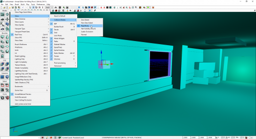
Although some issues may not seem obvious, we can check the collisions of the map in one of two ways (See Figure 3.2):

  • Alt+C to toggle collision wireframes
  • Selecting Flags Menu > Show > Collision Modes > Rigid Body

Fixing Issue 1: Small Prop Collision

This issue is the easiest to fix. Small props that don't really have a large profile or are too small to really be considered for collision can be fixed by:

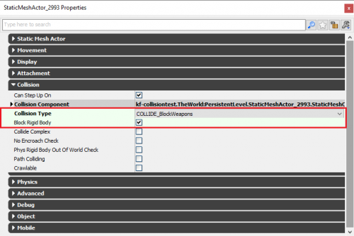
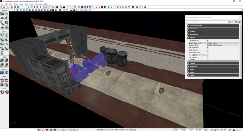
  1. Selecting the Properties and going to: Collision > Collision Type and changing the collision to 'COLLIDE_BlockWeapons'.
    1. This will no longer block players but will still act as a solid object if you shoot it, ie: bullet decals and impact sounds will still happen.
  2. Changing the Collision > Block Rigid Body to 'Enabled'.
    1. This will make sure stuff like your weapons and dosh will bounce off the objects and not clip into them.
    2. This will not affect player movement.

Figure 3.3 shows the final properties of these props.

Fixing Issue 2: Props that stop player momentum

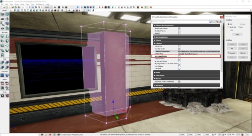
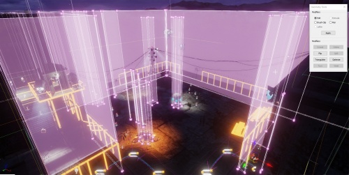
We can't really use the same technique above for larger props (such as pillars); doing so allows players and rigid bodies to enter into them which gives a bad feeling of polish and can break immersion. The best option here is to encompass these props in a KFPawnBlockingVolume that angles some of the side-faces as to 'ramp' the player off them. Doing this allows the player slide along the wall without stopping forward (or backward) momentum. See Figure 3.4.

It is a good idea to make sure that all walls allows the player to slide along them without being caught. The nature of KF2 higher difficulties often sees teams kiting around a map, and the last thing they want to encounter is a small object on a corner, wall or in the middle of their path that stops their movement.

By default the KFPawnBlockingVolumes have their properties to block rigid bodies. This can also be argued to break immersion or make the volumes feel out of place (especially for objects that act as small islands in the middle of an open room - not being able to throw dosh over them). If you wish to change this go to the volume's Properties > Collision and disable Block Rigid Body. Also displayed in Figure 3.4. This will allow rigid bodies to pass through the volume but also collide with the actual geometry of the meshes.

Fixing Issue 3: Props that players can stand on or stick out too much

The trim here can use either of the fixes from Issues 1 and 2. However, it would be best to use the blocking volumes. Disabling collision on may have problems previously discussed where items can clip partially inside them. So a simple rectangle volume could be used to cover the trim and the wall instead.

The crates will definitely need a blocking volume, however they also introduce new issues:

  • Putting a blocking volume around them might introduce a corner or 'wall-ditch' which would catch the player due to its proximity to the pillar and its volume; so running along it will cause the player to be caught and stop their momentum.
  • To avoid this we might also increase the volume's size to try and make sure it covers that 'ditch'. However, when we run along it, the blocking volume seems unnecessarily large and may also break immersion a little bit due to the 'empty space' it covers.

Simply putting a volume around the crates is 'Okay', but not the best. In these situations it would be good to reconsider the placement of crates as well, in this case you can:

  • Rotate their placement a little bit as not to create a corner for the player to get stuck on
  • Add some additional props to ease out the corners.

Ultimately it will be up to you to make the best judgement call here, but you should always consider what the player experience will be, and it should always take priority over prop decoration. In this case, I decided to slightly move the crates and introduce a small crate to fill in the 'empty space' created by the volume.

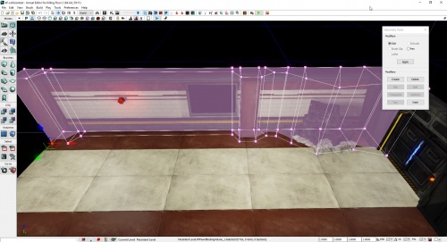
When you bring all these techniques together you can further optimize the volumes themselves. In Figure 3.5 I created a single volume that covered the entire wall of the corridor. I did not need to change the collision of any of the props apart from the alarm which stuck out from the wall just a little bit too much.

Figure 3.1: Common Collision problems that stop the player
Figure 3.2: Toggling on Rigid Body view-mode. Notice the slight parts of the mesh that stick out such as the window frame and top of the trim. Although small, are still large enough for the player to stand on or get caught on when moving into them.
Figure 3.3: Collision settings for small props
Figure 3.4: Creating a blocking volume that will allow the player to continue having momentum as they run into a pillar. Also displayed: Disabling 'Block Rigid Body' collision to allow objects such as weapons and dosh to pass through the volume.
Figure 3.5: Final result of movement optimization for the corridor

Looking For Map Exploits

Much like the discussions with movement optimization (especially with situation 3): If it sticks out, a player can stand on it, and they may be able abuse this to get in positions where Zeds cannot get to them. You will need to go over your map with a fine-toothed comb to make sure that no props can be used as jumping islands to escape the map or get into positions that would be considered an exploit.

Here are a couple of tips to find and fix exploitable spots:

  • Make sure all map boundaries are encompassed by tall collision boxes. See Figure 3.4.
  • After you have done an initial pass of player movement optimization, go through the whole map in Rigid Body collision mode and see if any props stick out.
  • Any props that look like they could provide some sort of ledge, platform or general area that could allow players to stand on - put a collision box around it.
    • Even the smallest piece of collision can be used and exploited.
    • If the player is not supposed to be able to get there, it should be covered with a volume.
  • Collision boxes themselves can be used as exploits - so make sure that they either extend to the ceiling or are high enough that players will never be able to reach the tops of them.
  • Spawn yourself a Double-Barrel Shotgun and spend some time alt-fire-jumping against possible exploitable locations all around the map - you may have forgotten one.
    • Use: enablecheats, god, giveweapon KFGameContent.KFWeap_Shotgun_DoubleBarrel, uberammo
  • Playtest with friends and ask them to find spots!
    • Its always good to have a fresh pair of eyes to spot areas you might have forgotten or did not notice.

Figure 3.6: Courtyard of Prison utilizing blocking volumes to stop players from exploiting parts of the map. Take note of the height of the volumes and position of some of them over props such as the trader and on top of poles which could be exploit spots

Fixing Zed Pathing

Just like how players can get stuck on props, Zeds encounter the same problems, however it is usually with the floors they run on. If you ever see a red/coral pathing with an 'X' in the middle of it like in Figure 3.7, most chances are that Zeds will have issues pathing between these path nodes. These are usually caused by:

  • Floors being uneven or static meshes intersecting a path.
    • This is the most common cause.
  • Not enough Height clearance
  • Not enough Width clearance
  • Nodes too high/low from the one it is trying to connect to

These issues are extremely common in parts of the map where Zeds spawn outside the map and enter through ramps or areas that are usually off-limits to the player. In most cases tweaking the position of path nodes, meshes and volumes can fix the issues. However, if this does not work due to how props are placed to form ramps or the ground, we can employ a neat little trick to 'flatten' the ground.

Instead of trying to perfectly align meshes or using volumes for Zeds to step on, we can place a hidden mesh over the props which acts as the ground while still looking like Zeds are running over the props. This is done in 2 parts:

  1. Turn the collision to 'COLLIDE_BlockWeapons' for the props that the Zeds will need to step over. See Figure 3.7.
    1. These are the exact same properties as in Figure 3.3.
  1. Place the mesh to act as a 'Ramp' over the props that Zeds climb over (I use the ramp from the modular kit). See Figure 3.8.
    1. In the Ramp's properties go to Static Mesh Actor > Static Mesh Component > Rendering and enable 'Hidden Game'
      1. This will hide the mesh when playing in the Game. You can check this by pressing 'G'.
    2. Next we want to make sure the mesh does not cast any shadows. Under Static Mesh Actor > Static Mesh Component > Lighting, we want to disable any options that make it accept or cast shadows
    3. Finally we want to set the collision under Static Mesh Actor > Collision > Collision Type to 'COLLIDE_BlockAllButWeapons' and disable 'Block Rigid Body'
    4. Figure 3.9 show these settings.

This is usually good enough to fix most pathing issues and is a pretty nifty trick that Official Maps use as well (Tragic Kingdom and Krampus Lair use these techniques). Just to be absolutely certain we do not get any weird pathing issues it is also good to:

  • Force a one-way path (yellow line) between the nodes on the ramp and the exit.
  • Proscribe a one-way path (red line) between the exit nodes and the ramp so the Zeds cannot backtrack back up the ramp.
  • Add a KFTrigger_ChokePoint, to reduce collision of Zeds as they go through the area.
    • This should also be used on any tight areas/doors/corridors on your map so Zeds do not get stuck on each other.
  • Make sure we add the KFPawnBlockingVolumes to the sides and in-front the ramp so the player cannot enter the area.

One last thing to mention, you do not want to use KFPawnBlockingVolumes as floors or ramps, doing so makes the Zed animations bug-out making them look like they are floating and stuck in a single animation as they move.

Figure 3.7: Error with pathing and setting prop collisions
Figure 3.8: Using a module kit ramp to act as the floor, this will be set to be Hidden in the game, so it will give the illusion that Zeds are walking on the props. Also note the forced and proscribed one-way paths and KFTrigger_ChokePoint
Figure 3.9: Settings for the Hidden Ramp

Mesh Merging

What and Why?

Mesh merging is a step that all level designers should do to their maps as they approach completion. It aims to further enhance the look of your map by combining multiple static meshes on the same plane/axis so that:

  1. Light Maps generated by the Engine will be consistent and look better
  2. Splat Maps will also look connected and part of the same object (eg: the same floor) instead of being disconnected

It also has the added benefits of increasing performance by:

  1. Reducing the amount of drawcalls required to render the object
  2. Simplifying and reducing collision calculations

This is because you are now calculating collisions and drawcalls for 1 mesh instead of say 4, 8, 20 and even up to 30+ meshes in some cases.

!--T:1--> Important Important: ALL MAPS SHOULD MERGE THEIR MESHES WHERE POSSIBLE!

How?

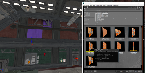
Before you dive directly into Mesh Merging you should do a preliminary pass over your map to see if you can replace smaller modular kit pieces with larger configurations when possible (eg: Two 1x1 floor pieces next to each other can be replaced with one 1x2 floor piece). See Figure 4.1.

Comprehensive Wiki Guide: Setting Up UV's and Mesh Merging (Killing Floor 2)

Community Video (by Seanchaoz): KF2 SDK Tutorial - Combined Meshes

Figure 4.1: Replacing smaller kit pieces with larger configurations. In this case I can replace 4 single wall pieces with 1 2x2 piece.

Setting Render Distance

What and Why?

When we are not looking or cannot see meshes, particle effects, lights or any other actors, it makes sense that they should not be rendered on the screen, especially if they are really far away. We can statically set the distances that these actors can render at to help improve performance of the map. This saves the Dynamic Occlusion System (discussed below in Precomputed Visibility) from having to determine if the object is still visible or not past a certain distance; ultimately increasing performance.

!--T:1--> Important Important: If you cannot implement Precomputed Visibility, you must at very least set proper render distances for ALL actors on your map.

This step can be done before or after mesh merging, but it is recommend doing it after so you do not have to go through all the meshes again and double check render distances after merging.

How?

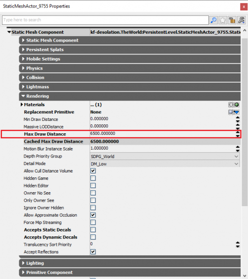
We can set the render distances on any actors by assigning a value to the Max Draw Distance variable under an actor's Rendering Properties (Lights, StaticMesh, Particle Effects, nearly all render-able actors contain a Rendering category). See Figure 5.1.

The value you set for the Max Draw Distance is highly dependent on the mesh's location on the map, so you will need to select portions of your map and assign them individually. Here are some general guidelines to help speed up the process:

  • You can check the distance of one mesh from another by using the orthogonal views in the main viewport (eg: Top, Side, Front views). If you press the Middle Mouse Button while in these view modes, you can draw a ruled line across a portion of the map which will give you the distance. You can use this distance to gauge what values to use for the Max Draw Distance. See Figure 5.2.
    • You can also accurately mass select large portions of your map in these view modes while in wireframe display.
    • Pressing Ctrl+Alt+Left Mouse allows you to quickly Box Select.
  • Try mentally break your map up into specific sections based on the viewing angles in which they can be seen. Once you figured out the different areas, select all the relevant meshes, lights and any other actors and assign them to a Layer. This is so you can easily toggle rendering of these sections on and off in the viewport; this is especially useful for multi-leveled maps.
    • You can access the Map's Layers by selecting the Layers tab within the Content Browser.
    • Alternatively you can get to it by going to: View > Browser Windows > Layers.
  • Try and break your map up in a High-to-Low fashion. Eg: Start of with the sections that will have the highest rendering distance, set them first, and then work down to those areas that might have lower distances.
  • You can only set Render Distances of multiple actors of the same type. If you have multiple selections of Lights, Particle Effects and Meshes at the same time, the Rendering category will not show up.
    • This is why it is suggested setting sections of your map to individual Layers. You can easily select a single type of actor and change their properties in mass in the Layers window.
  • After you set all the render distances, make sure you playtest your map and look at the different sections to make sure everything is rendering properly and nothing is accidentally set incorrectly. Adjust accordingly.
  • You will need to do this for all render-able actors. Including:
    • StaticMeshes, SkeletalMeshes, InterpActors, Lights, DecalActors, ParticleEffects/Emitters, KFCollectibleActors, KFDoorActors, KFDestructibleActors, KFFracturedMeshGlass

Examples

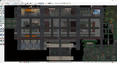
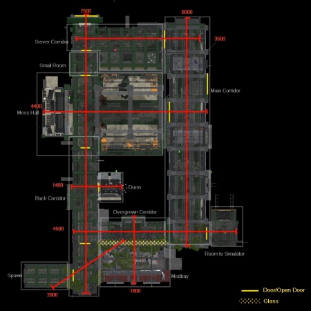
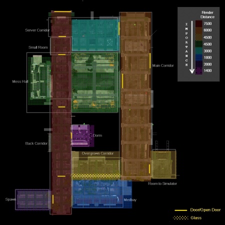
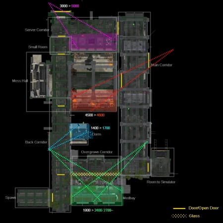
Below is an example breakdown of a portion of KF-Desolation and how rendering distances was approached and assigned.

  1. Originally start off breaking the map down into different room sectors. Draw lines through the visible viewing angles (going through doors and transparent meshes) and note the distances.
  2. From the initial ruling, break down the areas based on the longest distances working down. This means long corridors would break up the traditional rooms, and the remaining sections would receive that area's render distance (ie: the Mess Hall was split due to the long back corridor cutting down the back of it, that part of the Mess Hall received the 7.5k render distance, while the remaining parts of the room got the 4.4k render distance shown in the 2nd image).
  3. After setting render distances, playtest the map in the editor look for additional viewing angles that would need additional tweaking. The 3rd image shows the view angle (dotted line) and the meshes that had additional tweaking (highlighted areas).

Figure 5.1: Max Draw Distance Property
Figure 5.2: Distance Ruler indicated by the red line

Image
Description Step 1 - Initial Ruling on Line of Sight through rooms Step 2 - Setting Render Distances working on Largest Distance to Lower Distances Step 3 - Tweaking render distances after playtesting

Splatter Map Resolution Standardization
What and Why?

Towards the end of the creation process and after mesh merging you should take some time to address the Splatter Maps around the map. Having consistent Splat Maps around your map gives it an additional layer of polish; as during gameplay the map will be sprayed with blood on all sorts of walls, floors, props and ceilings and we want to make sure the scaling and presentation of the blood is consistent.

How?

You can check the consistency of Splat Maps on your map by selecting the SplatterMap Density [TW] View (yellow) and you can rebuild them by selecting Build Splatter Maps [TW] (red) shown in Figure 6.1.

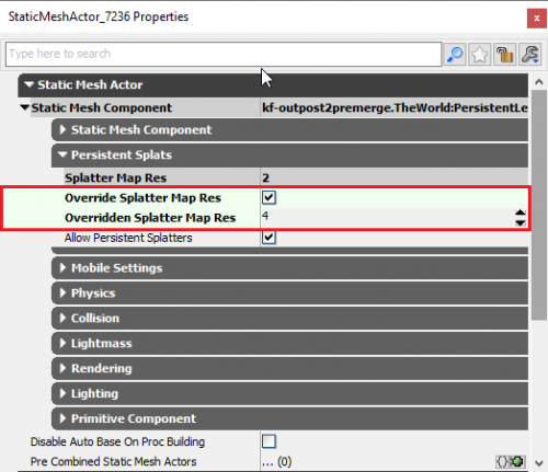
You can set the Splat Map resolution on any static mesh by opening the properties and enabling Override Splatter Map Res and Setting the value for Overridden Splatter Map Res under Static Mesh Component > Persistent Splats. See Figure 6.2.

You should aim to keep all the splatter maps consistent. It can be a time consuming process of selecting, tweaking and rebuilding splats but the end result provides a much more professional looking map when it is covered in that delicious KF2 blood.

There are a couple of console commands to help you debug when playing in the editor (these require you to enablecheats):

  • ToggleSplatterGun - Will allow you to spray the map with splatters, left click will toggle constantly placing splatters
    • Make sure that before you close the SDK, you toggle off the splatter gun. If you do not you may not be able to shoot in the base game, to fix just input the command again.
  • SplatterGun - Same as above, just requires constant left clicking
  • ClearSplatters - Does what it says
  • ClearCorpses - Does what it says
  • SpawnZed ZedName[FString] - Spawns Zeds - not as efficient as just using the SplatterGun

Examples

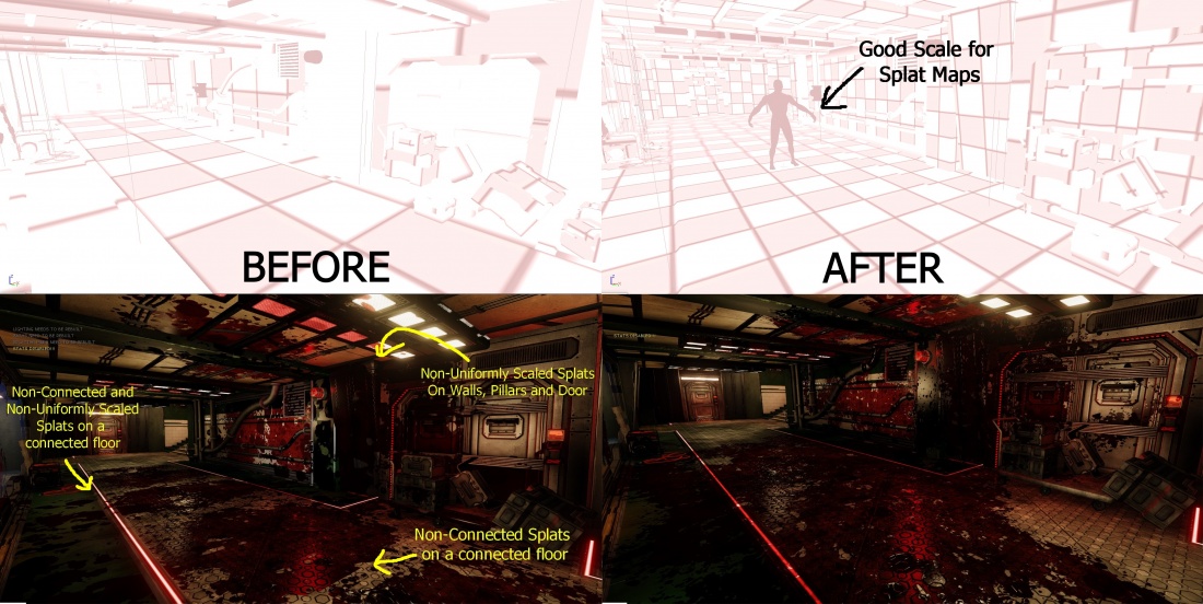
Figure 6.3 shows a before and after of Splatter Map Resolution Standardization.

A good scale for Splat Maps is also present in the image. You can gauge and check the scale in comparison to Zeds by pressing '\' which will hover a clot around the map. Generally Splat Maps should be able to tightly fit a single clot within them.

Figure 6.1: SplatterMap Density View (yellow) and Build Splatter Maps (red) Buttons
Figure 6.2: Splatter Map Override Properties

Figure 6.3: Splatter Map Standardization Before and After


Precomputed Visibility

What and Why?

Precomputed Visibility is a final optimization step that you can add to your map to squeeze the last amount of performance out it. Although we set the mesh and lighting render distances in a previous step, this was only one technique used to help actor culling in our map. By default the maps will use UDK's Dynamic Occlusion System, this is a fine approach in a general sense but it can have a performance cost with calculating what should be culled dynamically while playing. Utilizing Precomputed Visibility will allow us to statically save some occlusion culling around the map to increase performance.

How?

Comprehensive Wiki Guide: Setting Up Precomputed Visibility (Killing Floor 2)

Final Words

All the above techniques are used in Official KF2 maps to optimize the player experience. If you wish to make official quality maps that people would like to play and have good performance, you should implement all techniques discussed on this page.

It may seem like a lot to do, and it can be, but there is a certain charm and endearing quality to map optimization; especially when you see the performance of your map increase, even by a little bit.

Best of luck to all those who strive for the best out of their work!

-Delta